Healthcare Charity Logo & Brand Design.
Brand strategy, logo design, visual identity design
PMRGCA UK (Polymyalgia Rheumatica & Giant Cell Arteritis UK) are a national UK charity that offer support, guidance and medical signposting to elderly people who live with specific longterm conditions.
Their story.
The PMRGCA UK team had been operating for many years, doing amazing work in supporting people and their members who live with these chronic conditions. However, they realised that their existing brand identity and logo was holding them back; their brand name was visually confusing and the way their original logo was constructed meant that people who encountered the charity for the first time struggled to remember the name.
The team also felt that their existing charity brand failed to excite, felt tired and dated, and it failed clearly articulate their core values in way that resonated with their key demographic.
The old website and brand design.
The objective.
The goal was to design a warm and approachable charity brand identity that showed that PMRGCA UK exists to support people who live with complex and related medical conditions. The challenge was to improve the accessibility and readability of the brand name whilst creating a flexible and professional look-and-feel that will stand the test of time and position the charity brand a leader in the field.
“The challenge was to create a highly legible logo that expressed the qualities and mission of this fantastic charity in a way that built trust and a feeling of hope and support within our target audience.”
The outcomes.
This project consisted of brand identity development work and a strategic repositioning of this UK health charity. The secondary goal is to raise awareness and medical research into them, bringing these related conditions into the mainstream and building recognition of the conditions.
A brand pack that will serve the charity for the future
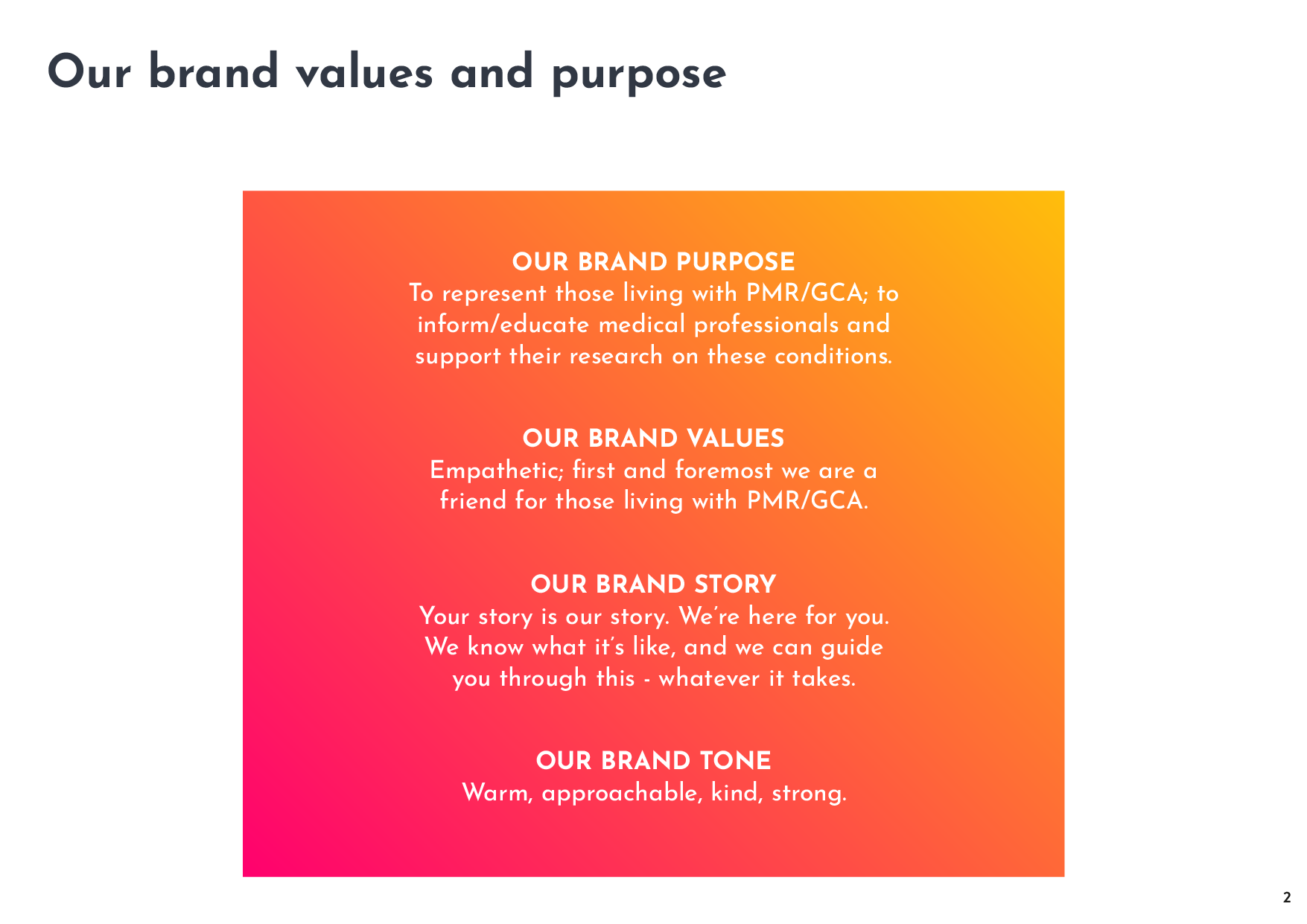
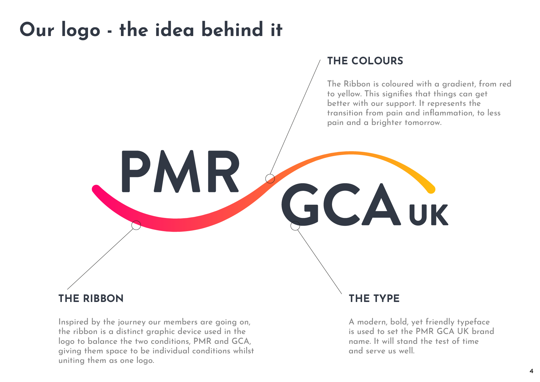
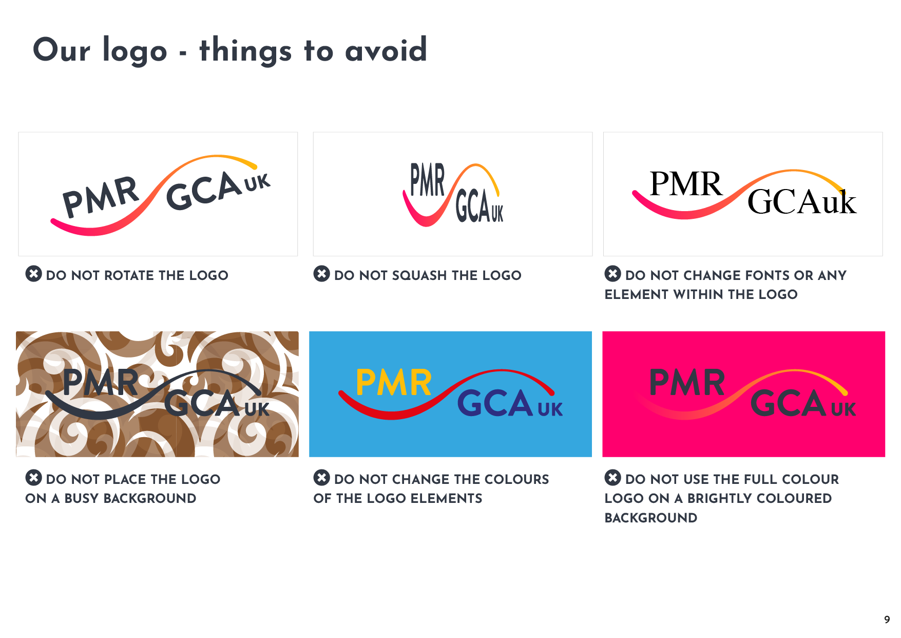
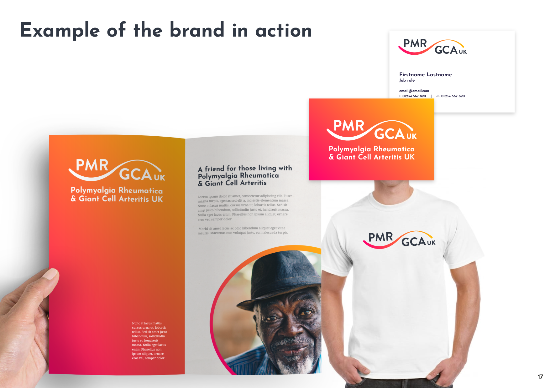
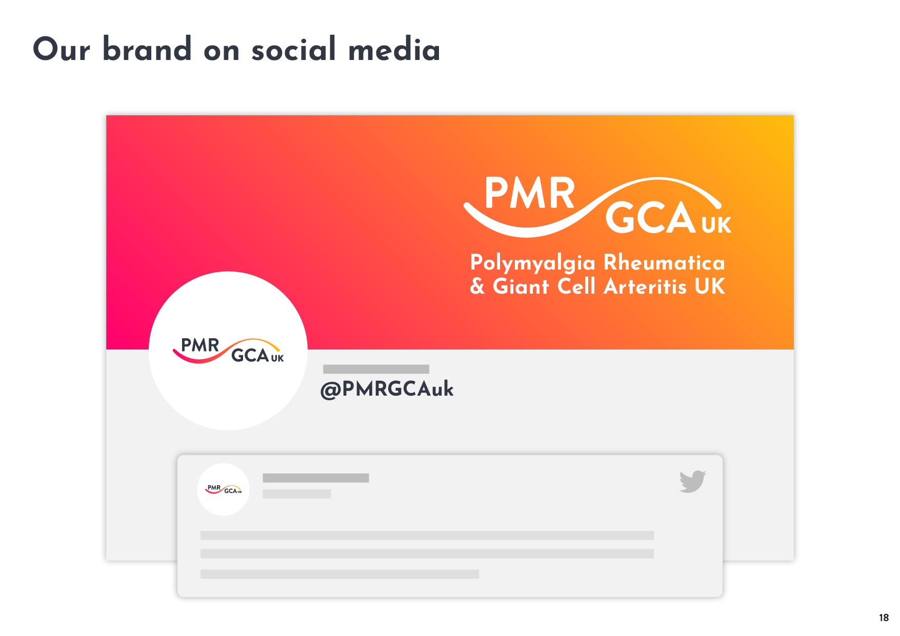
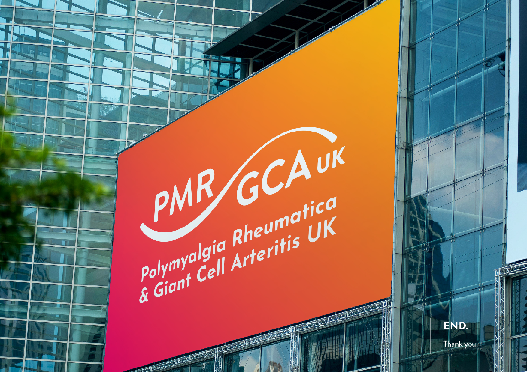
Following discussions and a brand workshop process to uncover the core brand values, purpose and story, the final creative outcome was a comprehensive brand guideline pack that showcased the new identity and logo design; providing guidance and assets to ensure brand consistency across digital and print platforms.
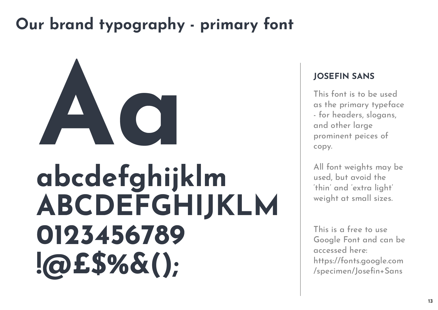
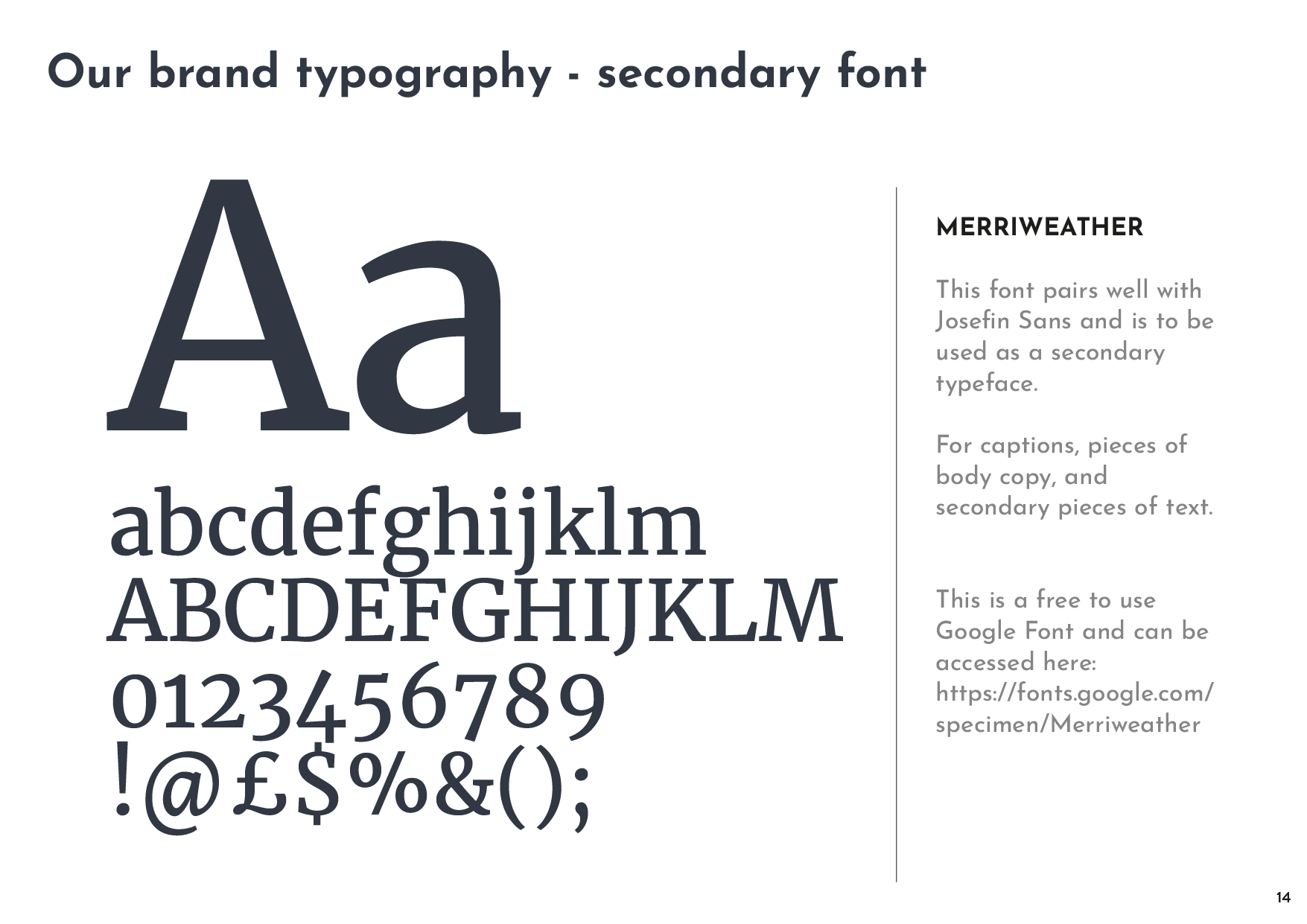
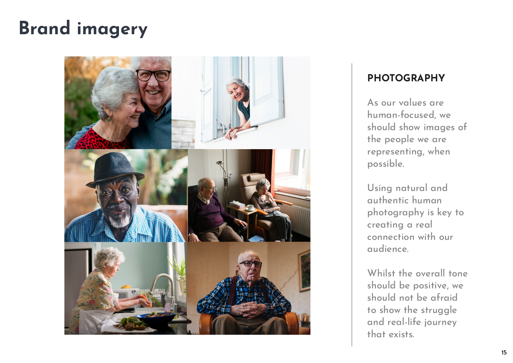
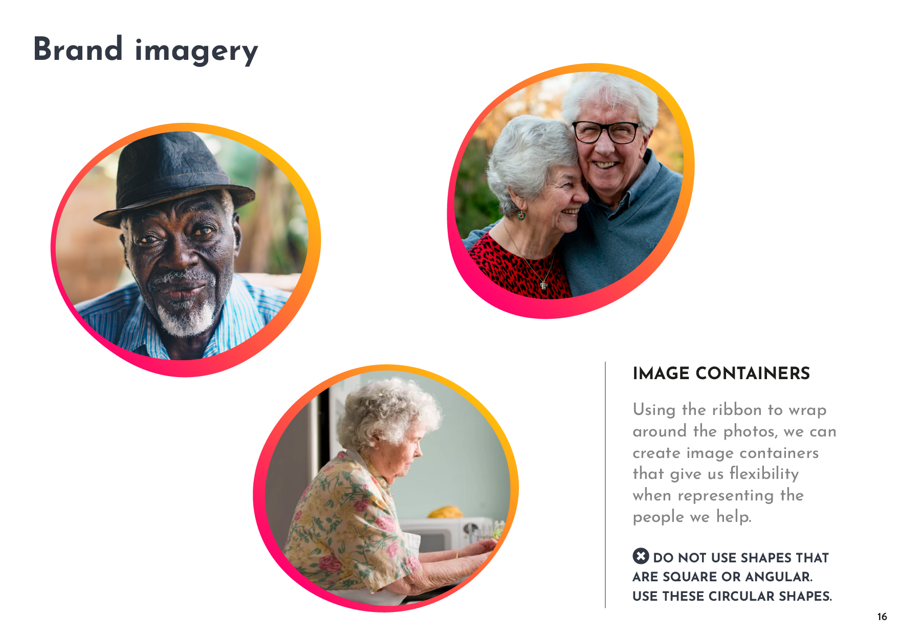
The brand pack.
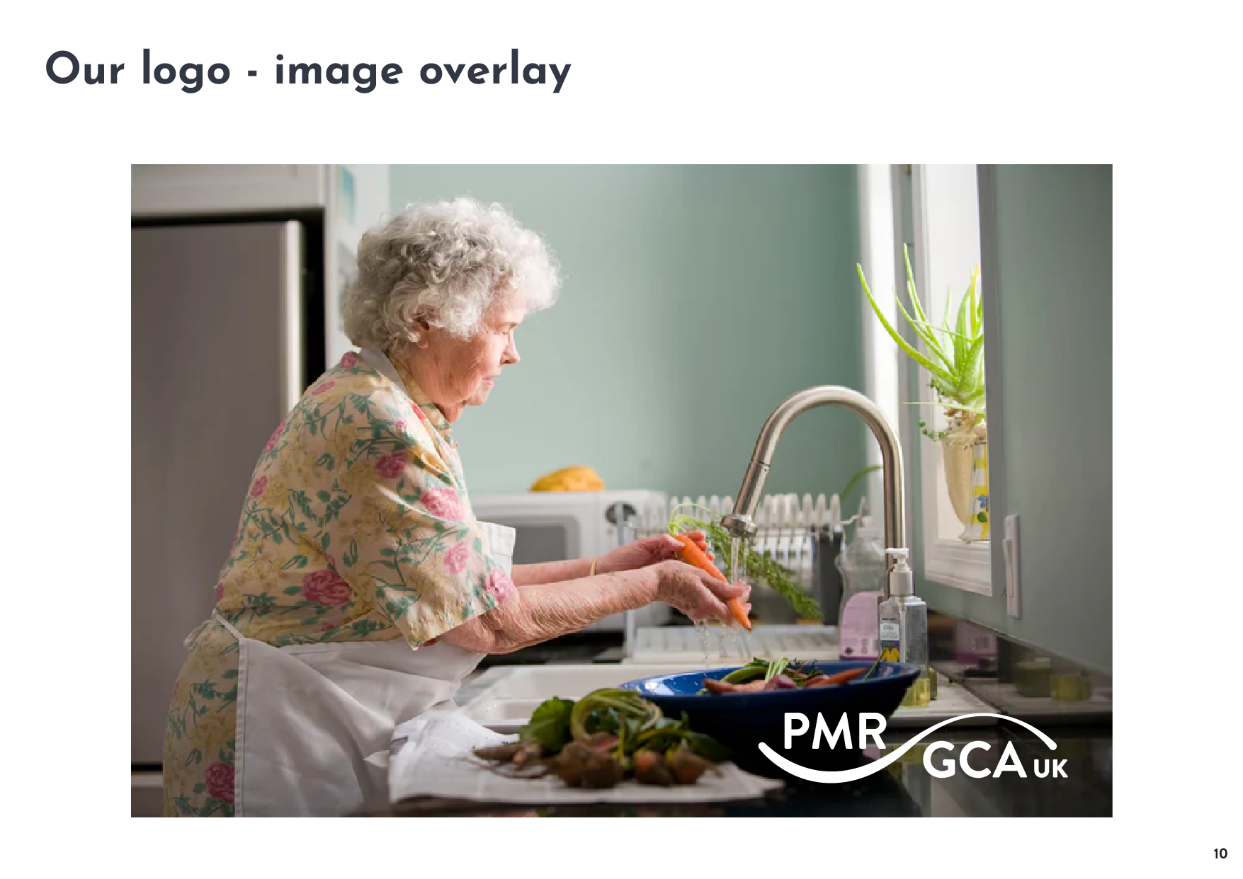
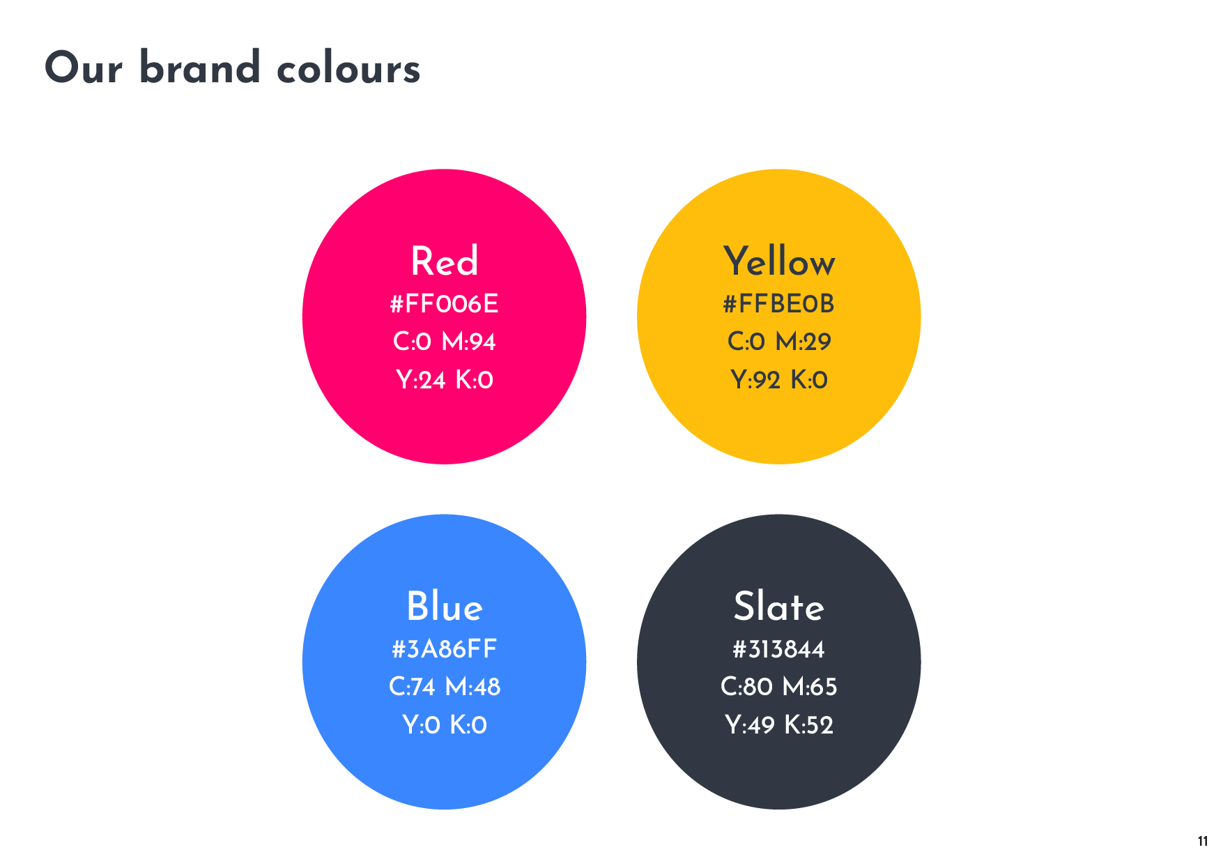
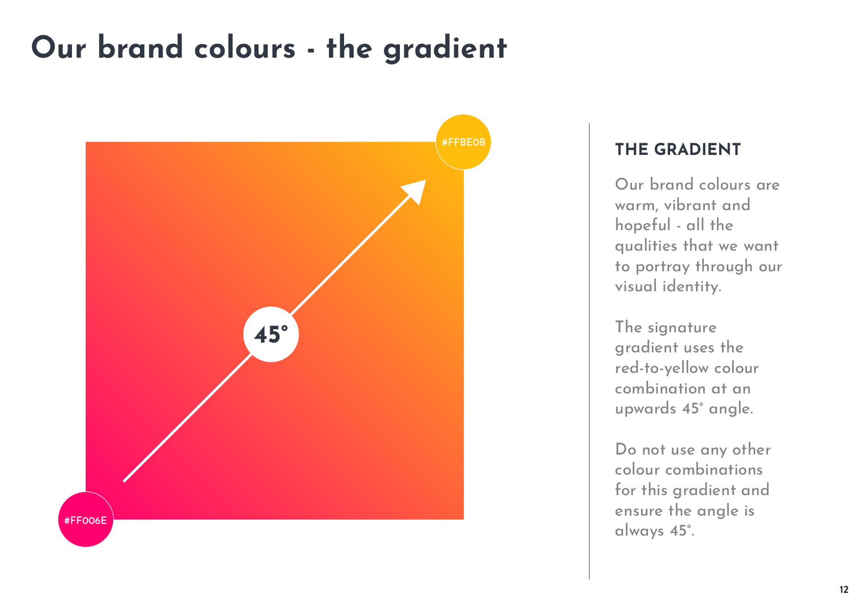
Alongside the logo design pack, including variations of the key logo with strapline variations and secondary colour options or added flexibility, we provided a brand font and typography suggestions to ensure consistency across all printed and digital materials. An uplifting and hopeful brand colour scheme was created to set the tone, and guidance on photography styles were provided to create a connection with our target audience.
“We are incredibly pleased with our new brand identity. The whole process was fantastic, we’ve clarified our vision and now have real brand confidence.”
“Working with Will has been a very rewarding experience. He kept us very focused on the strategic direction of the charity and interpreted everything into a distinctive brand identity.”
Is it time to rebrand your organisation?
Arrange a free and friendly discovery call today, and see how we could work together to increase your impact and boost your support.


