The Logo Strength Test: Can Your Logo Stand Up To These 5 Challenges?
Your brand is more than your logo, but your logo is still really important. It is typically the most recognisable and memorable asset of your business - it’s the thing people think of first when they hear your brand name and, if designed well, it will stick in their heads and create a positive feeling whenever your audience think of you.
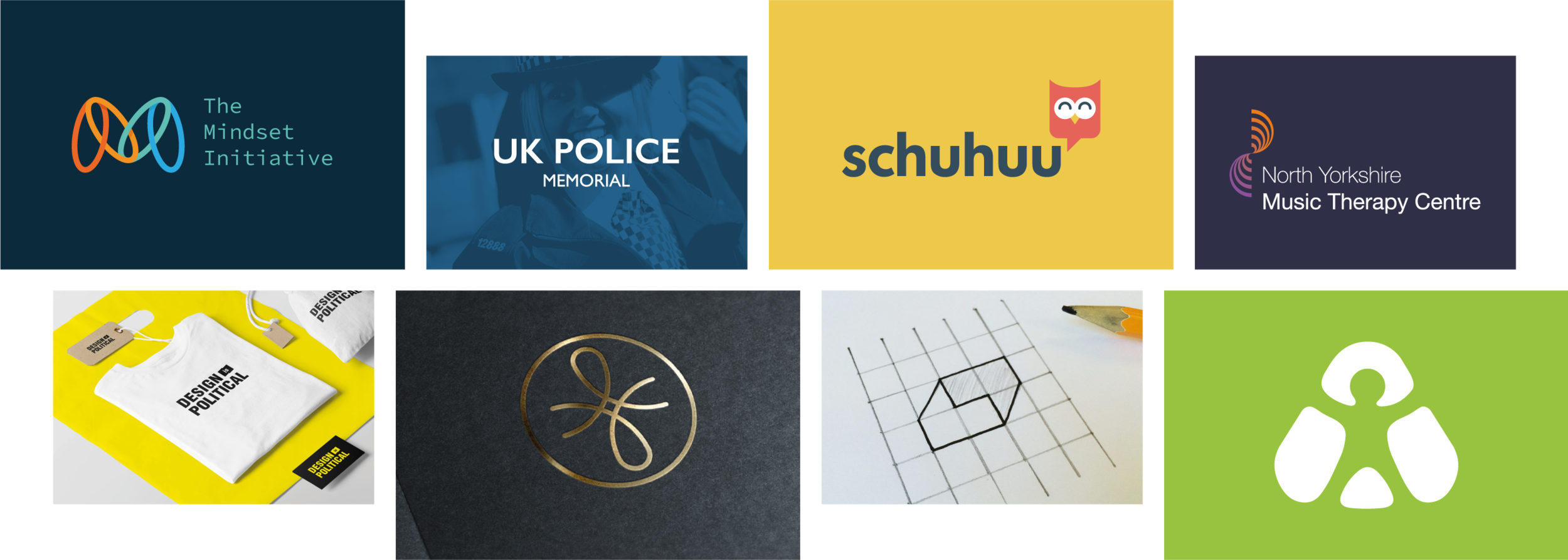
I’ve been in the creative industry my entire professional life; creating, exploring and designing brand identities for many years - from global corporate tech companies to independent book stores - and there is one thing that every single on of them have needed: a great logo.
I now work exclusively with ethical businesses, sustainable brands, and social enterprises to help them make a bigger impact through their brands.
When designing a logo it’s incredibly important that it is simple, memorable and can stand the test of time. This is because people are bombarded with hundreds of logos and brands everyday, so it is incredibly important to cut through the noise and stand out. Especially if your brand is on a mission to make a positive change in the world - you need to be seen.
“Can I test my logo?” I hear you ask… well, yes you can!
So, what makes a good logo?
From my 15 years of designing I have learned a few techniques to create an effective logo design, and to strength-test my designs to ensure they don’t crumble under pressure or time.
There’s a series of questions that I ask myself during my logo design process, they’re a reliable acid test to separate the strong contenders from the weak ideas. And I am sharing them with you because the world has enough terrible and ineffective logos in it, and if you’re doing something meaningful with your brand, I want it to succeed!
Here are the 5 questions to ask if you want a strong logo design.
1. Does your logo work in a single colour?
We no longer need to worry if our logos will work when put through a fax machine (remember those?), however, we do need to consider how well the design holds up when reduced down to one or two colours.
This is not just to ensure that your logo can be rendered in various applications; printed on the office ink jet in black and white mode, stitched into staff uniforms, laser cut into a wooden sign, or otherwise applied where colour is limited. There are practical reasons, like I just mentioned, but a logo that works well in 1 colour is also good practice because it forces the design to be simple. And because people have short attention spans, a simple shape with restrained detail and limited use of colour have a much higher chance of sticking in your audiences’ minds.
“Consider the silhouette of you logo. If your logo became all black, with no detail within it, would it still be recognisable? If you answer yes, this is a sign of a strong logo that will be memorable. If you answer no, perhaps your logo is not as strong as it should be.”

The takeaway here is that your logo CAN have multiple colours, however it must not rely on those colours for the logo to be visually understood, and using a limited palette typically works best.
2. Does your logo scale?
Our logos are seen on more platforms than ever before. In this digital world there is no end to how your audience will interact with your brand. You must consider the dynamic ecosystems in which your logo will exist within, with countless brand touch-points that range from 16 pixel website favicons and app icons to enormous animated billboards and banner stands.
If your logo design needs to scale up for large format printing, such as banners and billboards, it will obviously need to be professionally designed and be supplied in the correct file formats to avoid pixellation. The logo should be designed with flexibility in mind, and your designer should provide you with the brand asset pack you’ll need for future use - both digital and print.
From swiping through social media accounts where your logo will be whizzing past in a split second as a little avatar, to appearing on a badge in your branded merchandise that you hope your audience will wear, there are innumerable ways in which your logo will appear.
“Our logos are seen on more platforms than ever before. In this digital world there is no end to how your audience will interact with your brand.”
It isn’t always practical for your logo design in its entirety to shrink down to a thumbnail size. Simplicity IS a good thing, but I appreciate a certain level of detail is required to express your brand. So in some instances it a wise to consider how your logo can “reduce” if not simply scale, by this I mean there may be ways that your logo can simplify at smaller sizes. For example, is there one distinctive element that could remain even when other extraneous elements may drop away? The most obvious example of this is to allow the brand name/words to drop away, and the accompanying icon remains.
There are other, more interesting ways of solving this problem. This sometimes involves having a clever design system that’s been created with forward planning, and by ensuring your brand is equipped with a few versions of your logo that can enable you to elegantly reduce the logo down from the macro version all the way to a micro version with just a icon/symbol remaining. The trick here is to still maintain the core essence of the logo and brand feeling, without needing to show the entire logo.
Here’s an example of some unnoficial “responsive” logo designs that can scale and reduce down depending on the space available to them.
Examples from “ Responsive Logos ”. Via Joe Harrison
Your audience should be able to look at the micro version and the macro version and quickly gather they are part of the same brand.
3. Is your logo legible at a glance?
The average person is bombarded with hundreds of brands per day, so much that that somebody has developed a pair of “brand killer” glasses.
Most people are “normal” - unlike us designers who can obsess over little details in a logo and marvel at the perfect font combination - these normal people go about their daily lives and interact with these brands only when they have to. Most people have more important things to be getting on with! So they simply allow ‘essence’ of the brand into their minds; a rough picture in their heads and a vague feeling is what stays with them.
“We walk past logos every day and learn to recognise them over time, eventually a certain colour or shape triggers a feeling associated with that product or brand, so there needs be something distinctive and recognisable that the mind can anchor onto at a glance.”
Consider the various applications and places your audience will encounter your logo; zooming past on the side of a van? Splashed onto apparel and being strutted through the streets? Expertly engraved into a marble wall?
Does your logo design work in these various applications and remain legible and memorable at a distance?
4. Does your logo have one distinct visual takeaway element?
A great logo will have one distinctive visual element that sticks in people’s minds. Remember that simplicity is key to this.
Whilst it may be tempting to try and say everything with you logo, remember that your audience will rarely encounter your logo in isolation. Your brand is more than your logo, so bear in mind that every other brand asset you own has a role to play in informing and exciting your audience. All these elements build up to create a positive perception in your audiences’ mind.
“It is a mistake to try and cram multiple things into such a small piece of physical and mental real estate like a logo.”
Even if your company does a thousand things, the logo should serve to express the overall themes that tie them together. Logos and brand marks can enter the world without much inherent meaning, and have meaning poured into it by your marketing and messaging. So as long as your logo design expresses a feeling that you want associated with your logo - based on a good understanding of your audience and how you want to be perceived in your industry - you should be ok.
The main takeaway here is to say ONE thing, and say it loudly.
5. Does your logo portray the “essence” of your brand?
As explained in my previous point, a confident brand knows that its logo doesn’t need to describe every aspect of the business/product it is trying to represent. Rather it need only portray the “essence” of the brand or a strong concept behind it. So before you begin to visually express your brand values and everything you stand for, it’s vital that you have considered these and established your brand strategy before beginning the design phase. A good graphic designer will guide you through this.
Symbols, icons, and logos are incredible communication tools because they can either be literal and depict the “thing” they’re selling, or they can be more abstract and simply portray the “feeling” of the brand they represent.
A literal icon can be great as a shorthand for what you’re all about. And some certain audiences in certain industries expect to see certain themes, such as animal care companies or sanctuaries where you would expect to see a depiction of an animal. But just because there is a trend, it doesn’t mean we need to follow it. In some instances going against the grain or subverting expectations can make a bigger impact.

The iconic Nike logo uses an abstract shape that has had meaning poured into it by effective brand building, marketing and storytelling.
There are no right or wrong answers in logo design, which is what makes it so interesting. But sometimes it’s a wise strategy to design something abstract and to steer away from the literal. Consider the Nike logo; how much more expressive and “ownable” as a brand mark is their dynamic swoosh that, say, a literal shoe icon? It shows motion and energy without saying anything about the physical product it represents. This has allowed the brand to pour meaning into the logo, and the audience has come to associate that funny little shape with ambition, activity, health and boldness.
Your logo design, in summary.
Legendary logo designer Paul Rand once said “Don't try to be original; just try to be good.” which is not to say we should intentionally plagiarise other people’s work, or to not bother coming up with creative solutions, but your logo should work only as hard it needs to.
“A strong logo should communicate what it needs to, and nothing more.”
A well designed “simple” logo is usually more effective than a really “clever” or “original” logo that is executed poorly and looks messy.
So depending on what you’re trying to say and who you’re saying it to, you may explore literal or abstract icons and logos to express yourself.
Remember, your logo is simply a tool to communicate with your audience and the real power of an effective brand is the feeling it gives them.
Get a free personalised brand report.
Your logo is a valuable asset in building your brand, but there’s more to building your brand than just the visuals. If you’re working to make the world a better place, then your brand can be a powerful tool to help you get the job done. Take the Social Impact Brand Scorecard now and get a personalised report in just 2 minutes.
